What Makes a Website Easy to Use
A website should be simple for visitors to understand and navigate from the moment they land on it. If users have to think too much or struggle to find information, they are more likely to leave. An easy-to-use website focuses on clarity, structure, and making actions straightforward for the user.
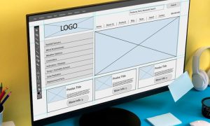
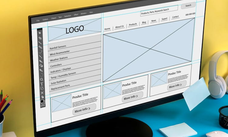
Clear and Simple Navigation
Navigation is one of the most important parts of any website. Visitors should be able to move through pages without confusion. Menus should be clearly labeled, and important pages like services, about, and contact should be easy to find. Keeping navigation simple helps users get what they need quickly without feeling lost.
Clean Layout and Structure
A well-structured layout makes content easier to read and understand. Spacing, alignment, and section organization all play a role in how users interact with a website. Too much clutter or too many elements on one page can overwhelm visitors. A clean layout keeps the focus on what matters.
Fast Loading Speed
Speed has a direct impact on usability. If a website takes too long to load, users may leave before even seeing the content. Optimizing images, reducing unnecessary elements, and keeping the site lightweight helps improve loading time and overall experience.
Mobile Responsiveness
Many users access websites from their phones, so the site must work well on different screen sizes. A responsive design ensures that text, images, and navigation adjust properly on mobile devices. A website that works well on mobile provides a better experience for a wider audience.
Readable Content
Content should be easy to read and understand. This includes using clear language, proper spacing, and readable font sizes. Breaking content into sections and using headings also helps users scan and find information quickly.
Consistent Design
Consistency helps users feel comfortable when navigating a website. Using the same colors, fonts, and layout patterns across pages makes the experience more predictable and easier to follow. Inconsistent design can confuse users and make the site feel unprofessional.
Clear Call to Action
Users should always know what to do next. Whether it’s contacting you, reading more, or making a purchase, clear calls to action guide users through the website. Simple and direct instructions help improve engagement and conversions.
Final Thoughts
An easy-to-use website focuses on the user experience above everything else. When navigation is clear, content is readable, and the site performs well, visitors are more likely to stay and interact. Keeping things simple and structured goes a long way in making a website effective and user-friendly.